
For more information, please feel free to get in touch:
Drop me a line: hello@hireduc.com
or connect with me on linkedin or twitter
Drop me a line: hello@hireduc.com
or connect with me on linkedin or twitter
Max Factor is known to be the make-up for make-up artists and famous for its facial symmetry and colour harmony theory. Having influenced Hollywood stars from Marlene Dietrich, Marilyn Monroe, to Gwyneth Parltrow our challenge was to help Max Factor create more glamour in stores. Especially in the make-up aisles crowded with brands, colours and products it was our aim to stand out. We had to find an engaging way to give Max Factor a fresh advantage over their competitors at the point of sale. So we created special tool for Max Factors beauty consultants to find the perfect colour for their customers.
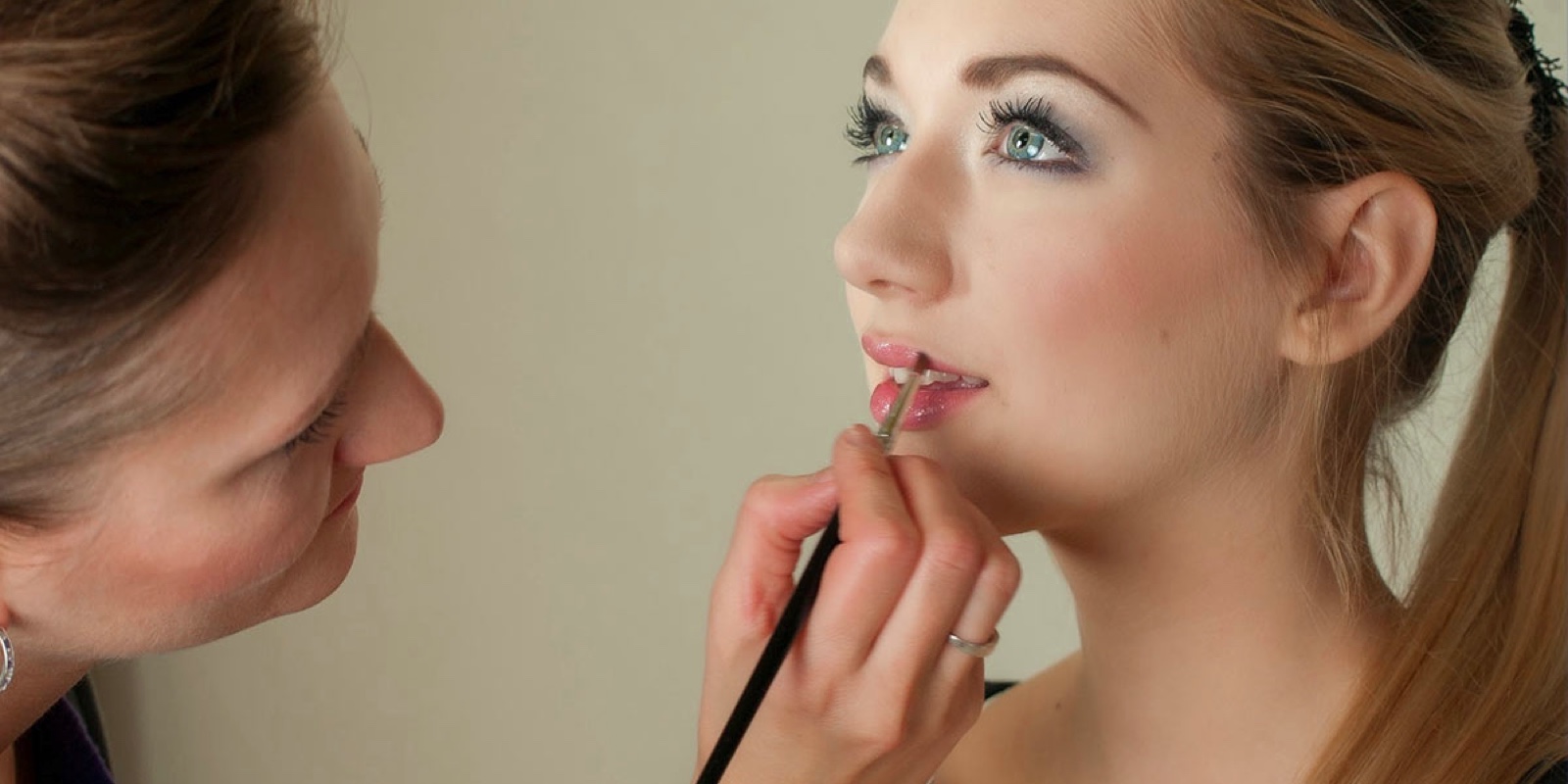
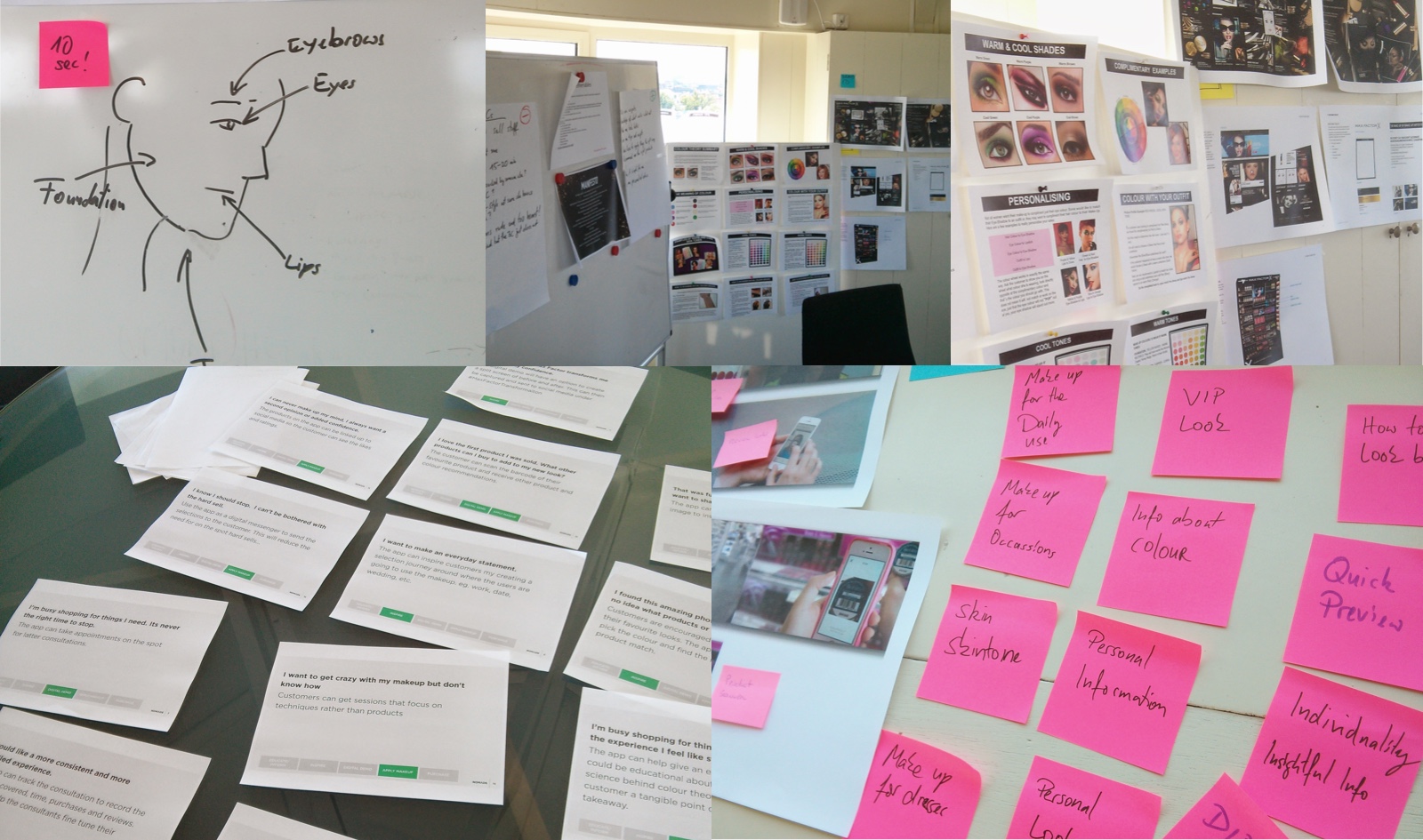
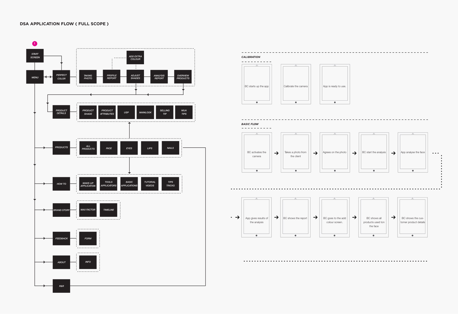
To find out more about the challenges beauty consultant face we went out to the field and interviewed them. A major obstacle they encounter is that it is difficult to encourage women to try out new make-up products. Therefore we needed to find a tool, that would help our BCs to engage with their customers. We developed several concept that were tested with a panel of Beauty consultants. Based on their feedback and their recommendations we iterated and created the "Perfect Colour", an innovative tool that inspires their make-up artistry skills and makes an accurate diagnosis to help them recommend personalised products. The app is in constant development taking in feedback from BCs all over the world adding and improving features, to make the tool better and better.
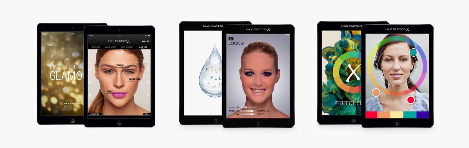
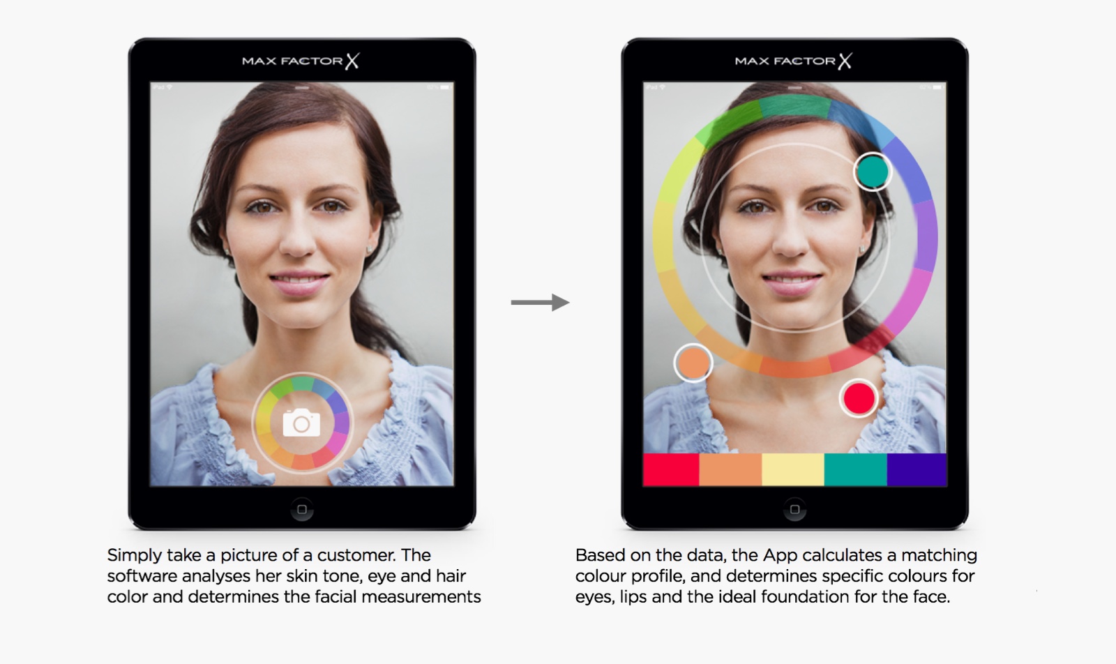
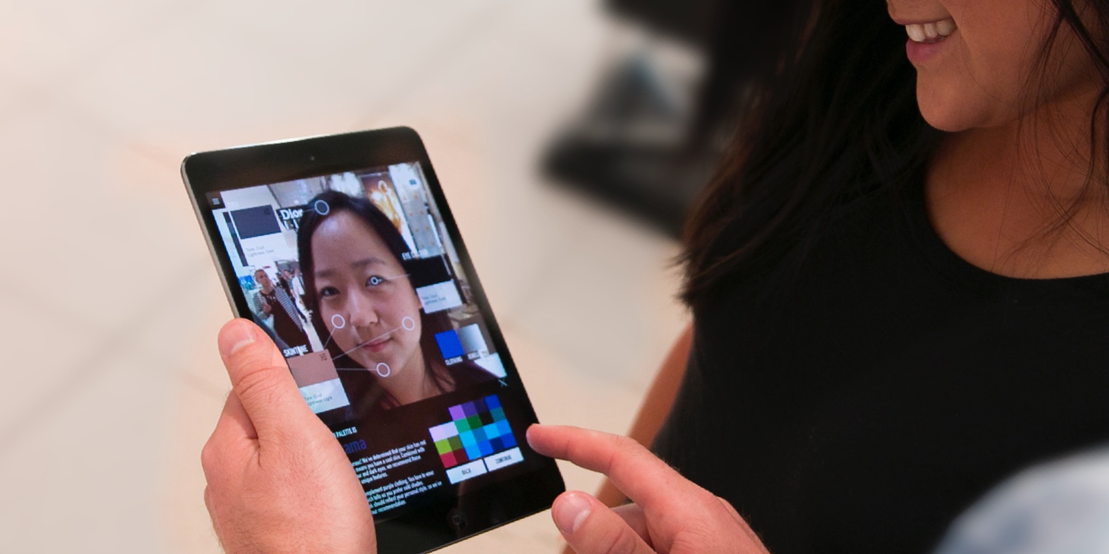
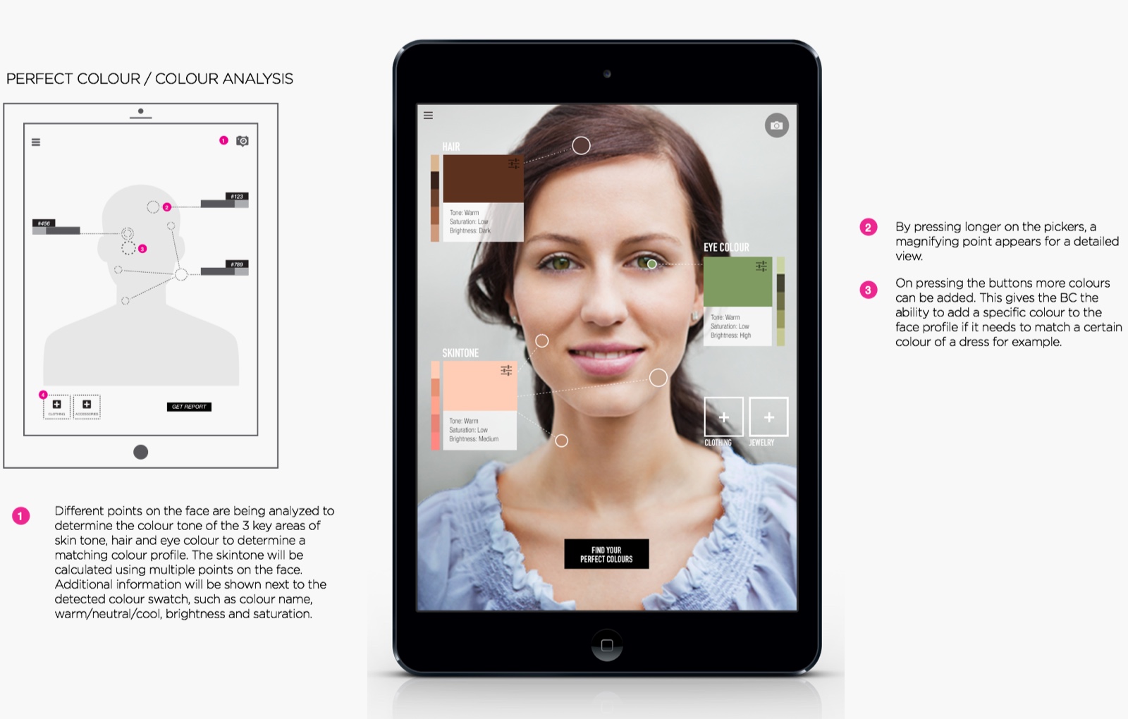
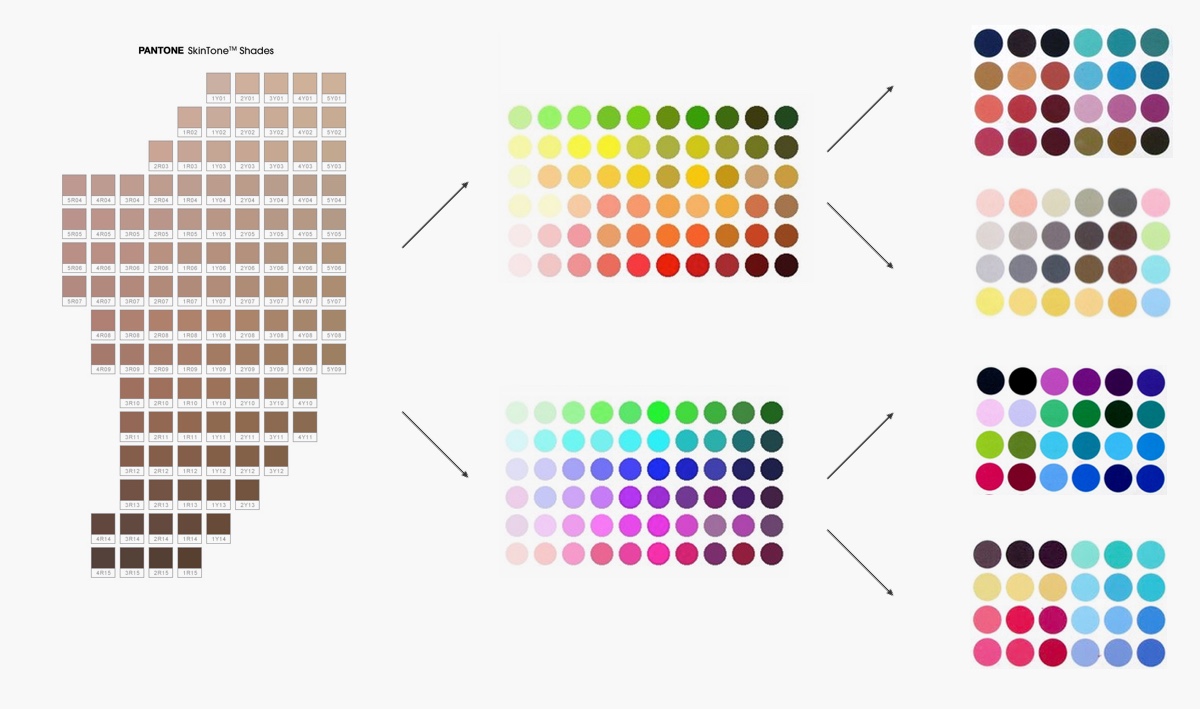
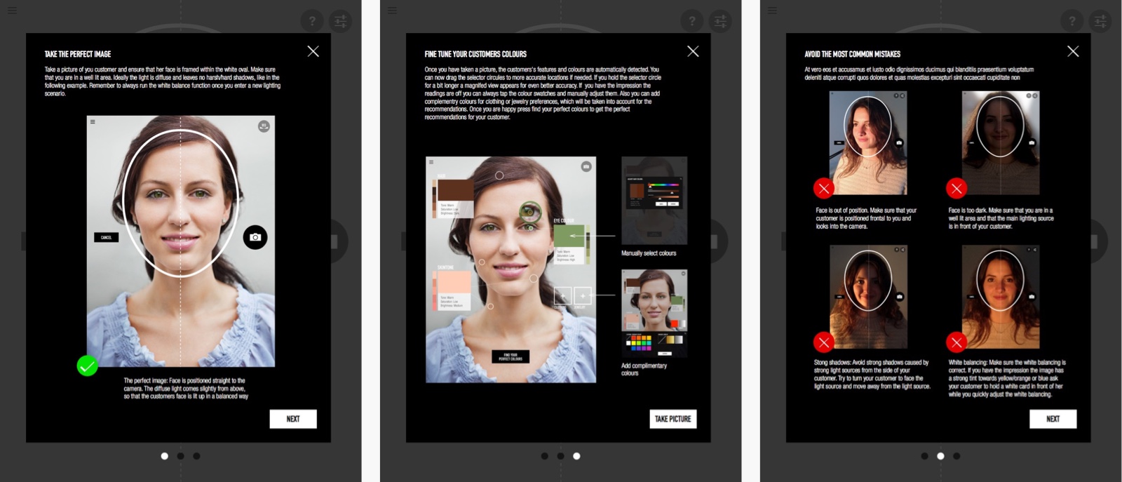
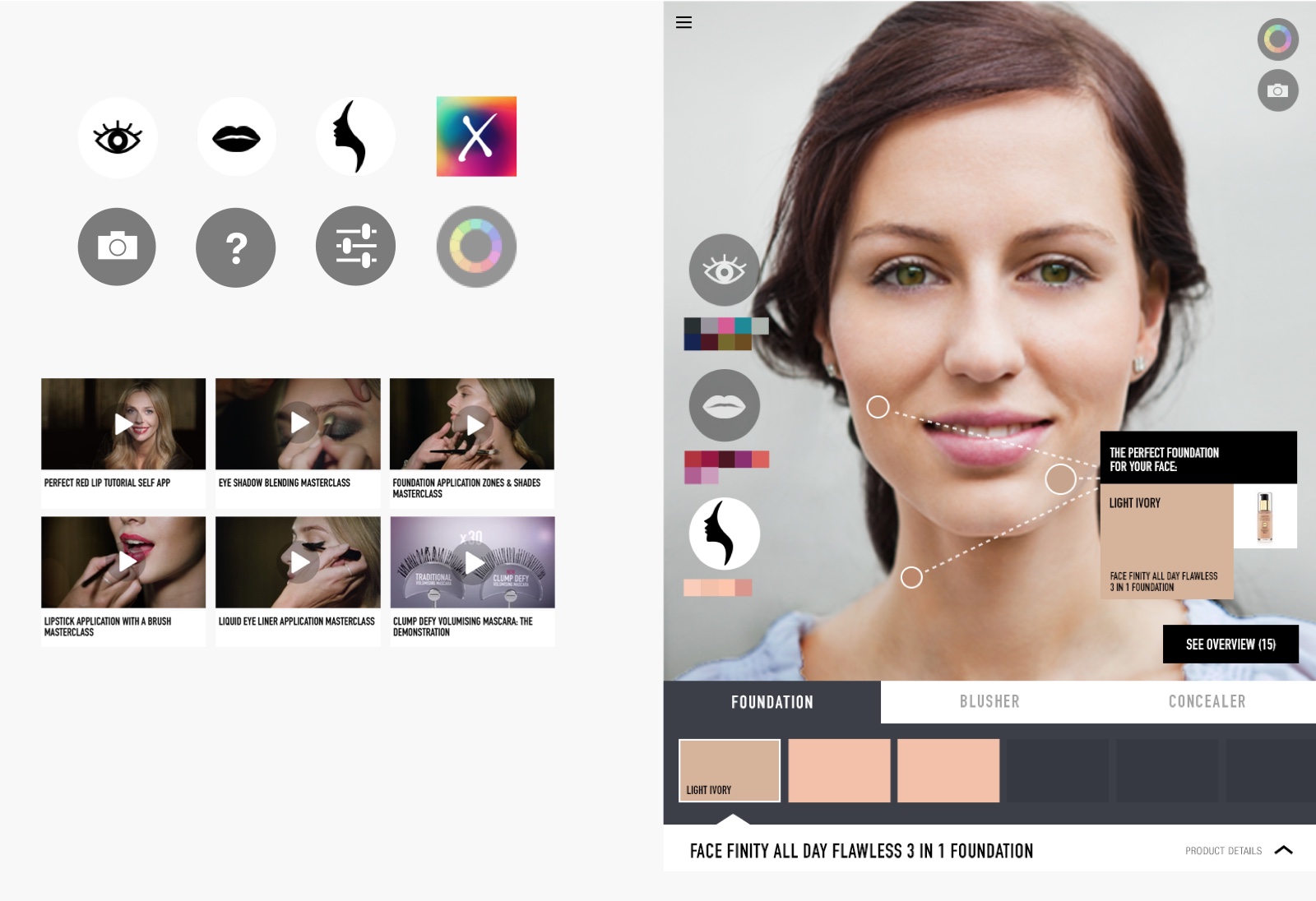
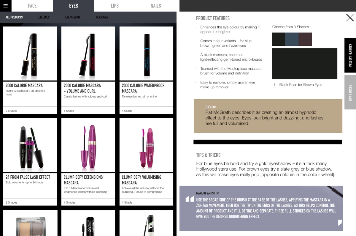
The app uses the built-in iPad camera to create an image of the customer. The app recognizes color data points from the customers hair, eyes and face and creates a personalised colour profile using Max Factors colour theory. This profile is then matched against the product database to output inital recommendations. Together with the expertise of the BC the customer can determine what will fit best and have a first glimpse of how the make up would look on her.
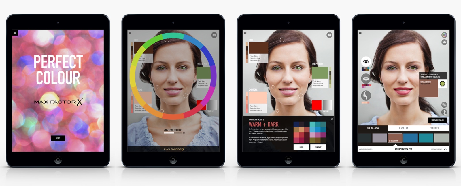
The user experience was specifically tailored as a shared experience between Beauty Consultant and her customer. Next to the colour recommendation tool, the app also served as an education piece helping the BCs to gain more in-depth knowledge. It also kept them informed about the newest products, look trends and tips. The interface was designed to be simple and intuitive so that BCs would always be able to access every area they needed no matter how hectic their current situation would be. Also tailoring it to an Ipad mini made sure, that BCs would be flexible and could move around in the retail environment without restrictions.
The visual language was set to match the premium character of Max Factor. Colour palette, typography, forms and shapes were designed to be minimalistic, simple and reduced. The user interface was carefully crafted to be touch friendly. Icons were used to simplify the app and made for a daily usage that needs intuition and clarity.
After developing a MVP in September 2015 the app had been been trialled in the UK and Dubai. Both markets have reported a noticeable increase in point of sale contacts and in-store engagement with the brand. The app was officially launched in December 2015 and will be rolled out in several countries in 2016. To ensure even more beauty consultants will be able to bring more glamour in-store, we are working on mobile phone version that will be launched in Q3 2016.
UX and Design Direction: Duc Nguyen
UX Design: Sjoerd Derine
Visual Design: Jessica Minn
Project Management: Ryan Mangler
Agency: Nomads
Client: Proctor & Gamble
P&G Brand Management: Fabio Stefani Development: Nomads Amsterdam

